
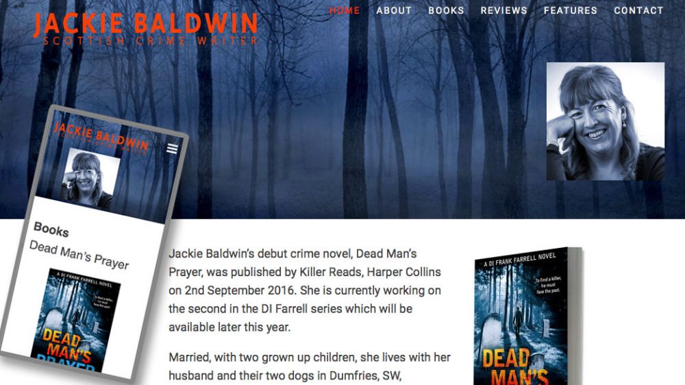
You may have heard people talking about responsive websites but what does it signify? A responsive site is one that that looks good and works well on all types of devices: televisions, desktop computers, laptops, mobile phones or tablets like iPad. One design that automatically adjusts to fit any screen size. I’ll try to explain:
Imagine Different Screens
Compare your website to a sheet of paper. On a big screen you have a full-size poster, but on an iPhone you have a pocket-sized flyer. A responsive website has a single design which adapts from a poster into a flyer when needed.
Flexible Layout
Instead of your website being one fixed size, it’s flexible. Everything on the website, from pictures to text, can grow or shrink to fit the screen of the moment. It literally stretches or squeezes to match the device.
Intelligent Organisation
Think of your website as a book. On a big screen, you see the whole story at once. On a small screen, you have to view one page at a time. Responsive sites allow the reader to view everything in the right order without missing anything, no matter the device.
Easy Reading
The words and letters on your website can adjust in size. On different screens, the size of type can be adjusted allowing you to read comfortably.
Pictures that Fit
The pictures on your website can be presented according to the size of screen available. Responsive websites make sure your images are always presented favourably according to your wishes and the screen size concerned.
How on Earth Does That Work?
Designers use media queries and flexible layout coding to ensure that the device can access the code it needs to display the site correctly. Web designers test your website on all sorts of devices to make sure your content works and displays pleasingly.
Happy Visitors
Web design keeps evolving as hardware and technology improves and changes. Designers keep learning new tricks to make your website even better and better. When your website is responsive, visitors can easily read, click, and access eveything they need, just as they would expect, no matter what device they use. This keeps them happy, and they’ll want to come back for more.
So a responsive website is a bit like an outfit that fits and looks great on everyone, no matter their size or shape, it ensures that your visitors have a fantastic experience, whatever device they choose to use.